Critique my amp faceplate/shell design.

  • Thread starter Thread starter MadAsAHatter
  • Start date Start date
MadAsAHatter

MadAsAHatter

Well-known member
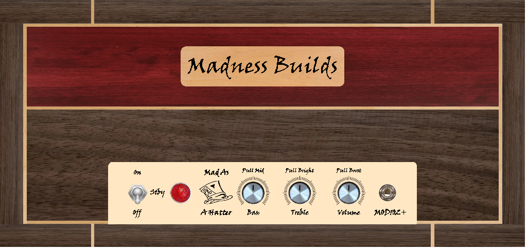
I got my MOD102+ amp kit the other day. The "faceplate" that came with the kit is just a sticker. I'm going to make a plexiglass plate and have been playing with the design. I'm also going to build a shell and keep it natural wood instead of covering with tolex.

Here's a rendering of the faceplate itself and the shell. I'm pretty happy with the way it looks, but always second guessing myself thinking I could do better. '

Let me know what you think.

1707433955970.png


1707434164468.png
 
Looks cool to me. The only comment really is a passing one - the font. Stylised lettering like that can be hard to read if small. Cool for the badge and 'Mad As A Hatter' but worth considering a boring, regular font for everything else.

Having said that for a personal amp the opinion of others doesn't matter, if you dig it then it's good.

Is it a Champ kinda thing?
 
Simple is good.
I like it.
Is the wood going to be like a veneer?
Not super crazy about all the hash marks - I think you could simplify it even further be having none :dunno:
 
I feel similarly. Bad choice of typeface for the lettering. I like the hat graphic though. Also, maybe simplify to 'Mad Hatter' above and below the hat graphic, so it doesn't have the awkward word division, 'Mad as...a Hatter'?
 
I like everything except the typeface.

I think you can find a better font that gives the vibe and is a little more readable
 
Monopoly like guy with hat on and hat off in hand for on/off. 🤷
Might try different color scheme. The 70’s recreation room paneling color kinda bland.
 
Honestly?.... I'd feel like a Slash tribute having a tophat on my amp.
 
Is it a Champ kinda thing?
Yeah, it's a Class A, 8-ish watt Champ style amp, but with an EL84 instead of 6V6 with couple of extras for mid, treble and gain boost.

Is the wood going to be like a veneer?
No veneer. I plan on using all hardwood. Walnut for the outer shell and bottom part of the face. If the lumber yard has a nice, red piece of bloodwood I'll do that for the top part of the face. If not I'll pick something and stain it burgundy. The "piping" will be thin strips of maple.

@ZEN Amps @311splawndude @Sermo Lupi @DanTravis62
I had similar thought of what y'all said about the typeface. I like it for the larger badge, but unsure how readable it would be on the faceplate. Here are some other versions I did. I need to do some test prints and maybe play with the size a little more too. The hash marks may or may not stay as well. It all depends on how sharp and readable everything will print out.

1707468695976.png


1707468742625.png
 
Well, these are still serifed, italic fonts with a hand-written vibe. That doesn't add to legibility in most cases.
I like the 'Mad as a Hatter's font on the top one better. A tad more unique.
 
The cab is nice but I don't like that modernized lgbtq version of a jewel light. Please fix that.

I also want a separate toggle switch for standby. Have you looked at any Mesas? They are always generously appointed with toggle switches. It seems like you are cheaping out.

And why does everything have to be a pull pot? More of a headache than a few more dials.
 
And why does everything have to be a pull pot? More of a headache than a few more dials.
Probably not. a Pull Bright on a Treble pot most likely switches to a different bright cap and then still uses the same variable resistance of the same pot.
Adding another potmeter doesn't switch between 2 caps, but you'd need additional circuitry to make a distinction between 'normal treble' (maybe around 6-8kHz) and a 'high treble' (around 8 to 12kHz).

But, I'm no amp designer, so someone with more knowledge about this could provide more insight here. :geek:
 
The cab is nice but I don't like that modernized lgbtq version of a jewel light. Please fix that.

I also want a separate toggle switch for standby. Have you looked at any Mesas? They are always generously appointed with toggle switches. It seems like you are cheaping out.

And why does everything have to be a pull pot? More of a headache than a few more dials.
The jewel is just a picture I found to use as a place holder. The actual light looks more like what you'd see on a vintage Fender.

You'd have to take it up with MOD electronics about the circuit design and lack of toggles. I'm just building the amp kit as is.

From the schematics there's not much in the push/pull pot that could be transferred to a dial. Mid boost adds a 10K resistor into the path, Bright switches to a different bright cap (like @Speeddemon said), and gain boost toggles a 0.047 uf capacitor. I guess if one wanted to transfer the pull functions to toggle switches instead and/or add a mid knob; that could be done. But it's a small chassis and not much room for anything else. And I'm still a novice and don't know enough to go full bore designing mods on my own. I might get there one day though.
 
I like reducing amp name down to "Mad Hatter"
Also consider removing the word 'Pull' - owners and potential buyers will know what to do.
 
I like reducing amp name down to "Mad Hatter"
Also consider removing the word 'Pull' - owners and potential buyers will know what to do.
I may drop 'pull' from the wording. It's more aesthetic than function.
I'm still tweaking the details and did increase the font size a little. I got it to where it's easily readable but not too big looking. The other part I tweaked was the hatter part. I'll keep the full "mad as a hatter" since it's my SN everywhere, but I rearranged it so the wording is all together.

Still not sure if I want to leave "MOD102+" there or if it looks a little too squeezed since I upped the font size.

1707502326288.png
 
I may drop 'pull' from the wording. It's more aesthetic than function.
I'm still tweaking the details and did increase the font size a little. I got it to where it's easily readable but not too big looking. The other part I tweaked was the hatter part. I'll keep the full "mad as a hatter" since it's my SN everywhere, but I rearranged it so the wording is all together.

Still not sure if I want to leave "MOD102+" there or if it looks a little too squeezed since I upped the font size.

View attachment 286865
I think I like this best
So the pull pots do not actually pull?
You could also consider removing Stby as owners will know what to do
Then consider moving MOD102+ over there to the left but either way, I'd leave it on there
Classy look man in an old school way. Good luck with everything bro.
 
So the pull pots do not actually pull?

They do pull. I meant it as labels I put on are for aesthetics, not to know what the knobs do. I'll be the one and only owner of this amp until I die so I'm not overly worried if the labels make full sense. I'll know what they actually do.
 
Back
Top